
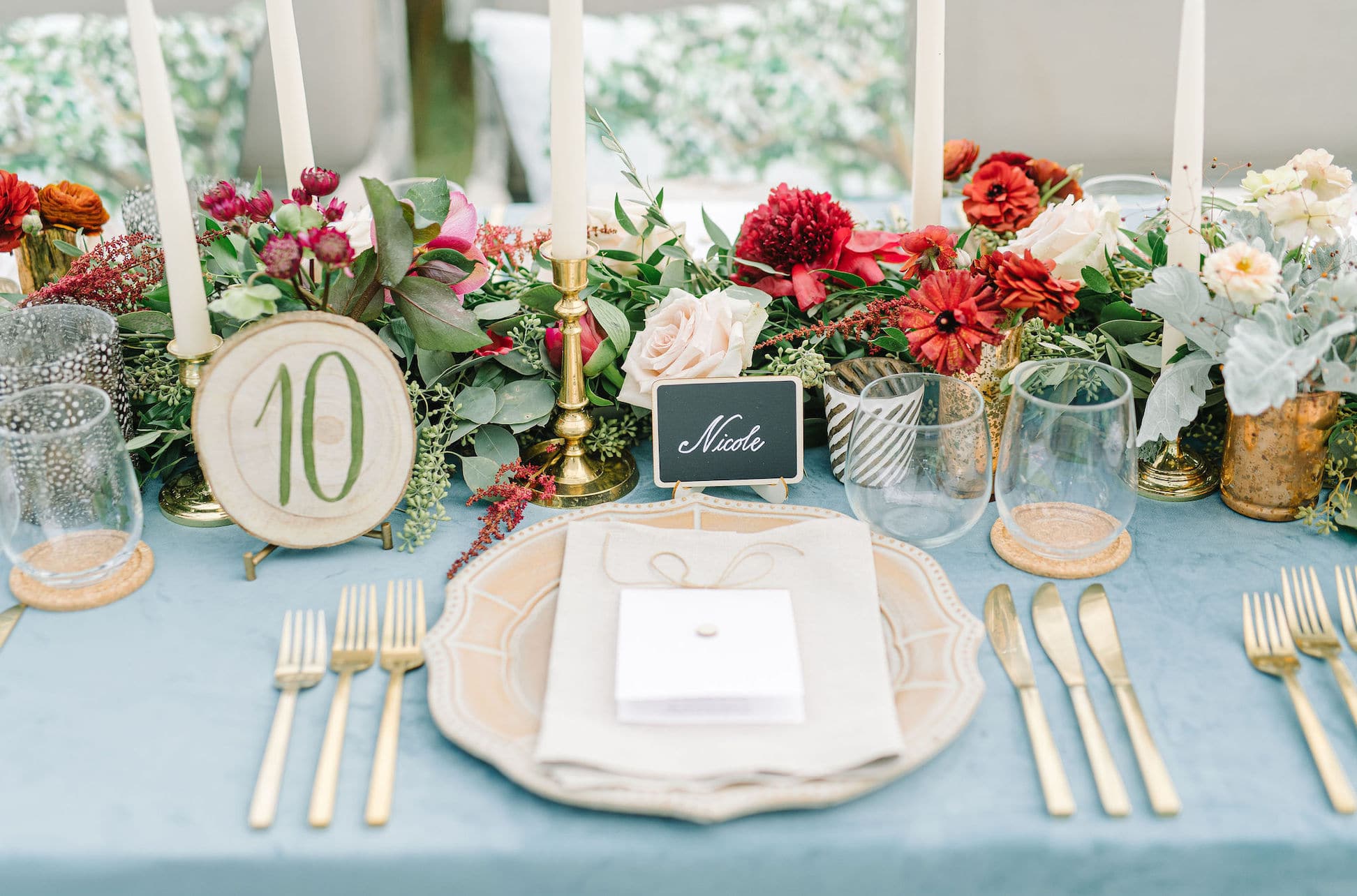
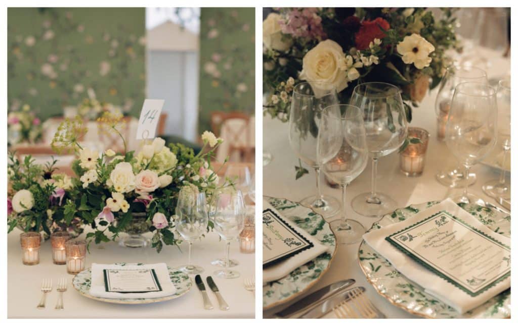
A pretty place setting is icing on the cake when it comes to table design. And, it’s one of our favorite parts to design. It’s a place to provide lots of detail, and as we know, it’s all in the details. So, let’s talk about some pretty place settings today. We definitely love a charger as a starting point. Napkins, menu cards, etc just look so much prettier when presented on it’s own showpiece.
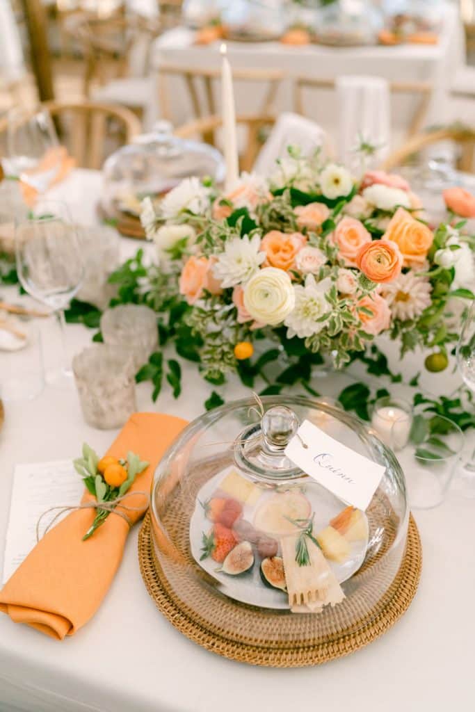
Sometimes what we serve allows us to get creative in the presentation. For a wedding with a fruit and cheese plate as it’s first course, the bounty was served under a glass cloche. And, we love to play around with our napkin designs. We almost always use 100 percent linen napkins. But, sometimes they hold the menus, sometimes they get adorned. Here, a fresh kumquat sprig is tied and secured with twine.
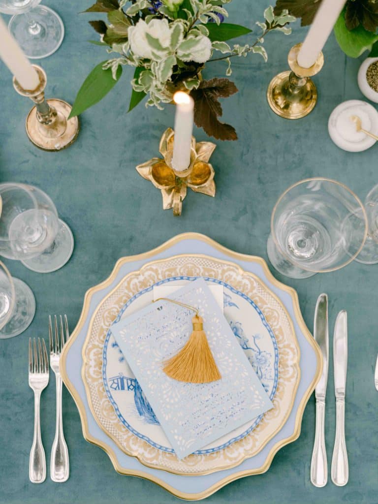
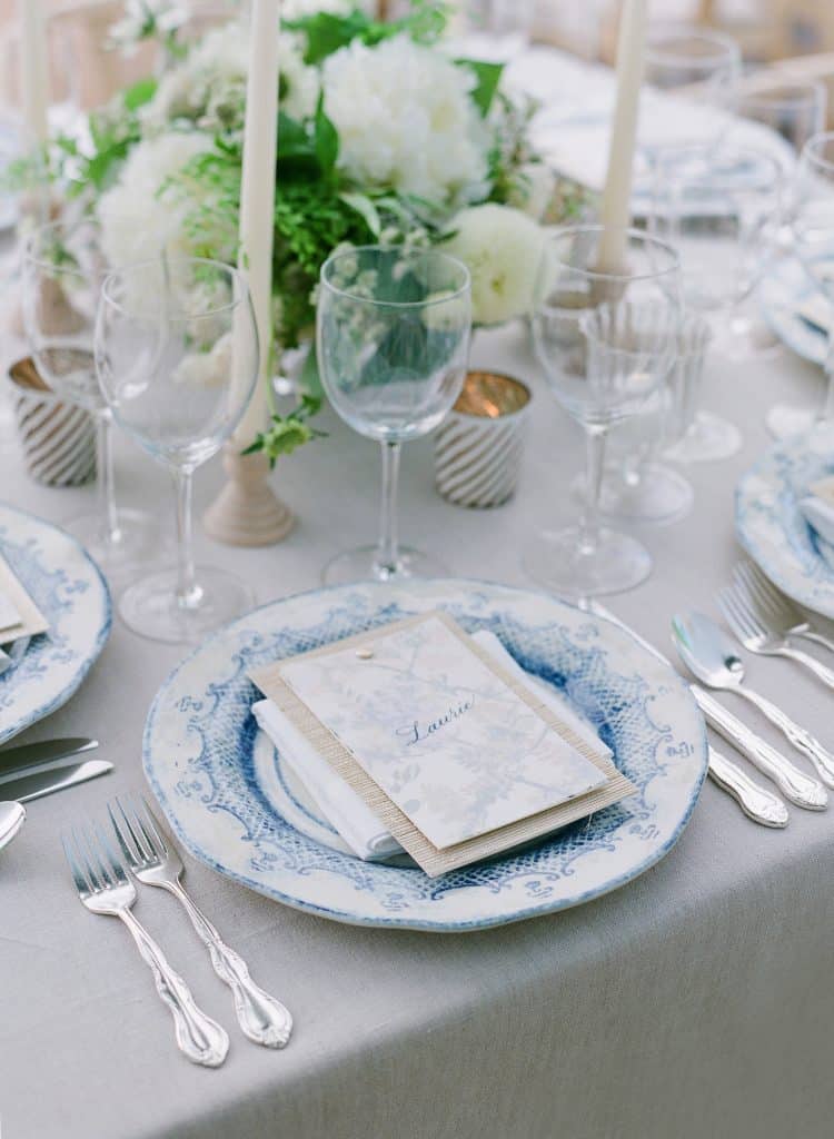
And, sometimes the charger or china is the main focus of the design. Maison de Carine is one of our favorite sources for beautiful pieces.
Also, for brides wanting a more neutral or muted palette, the tabletop can be a nice and subtle place to bring in smaller pops or versions of color.
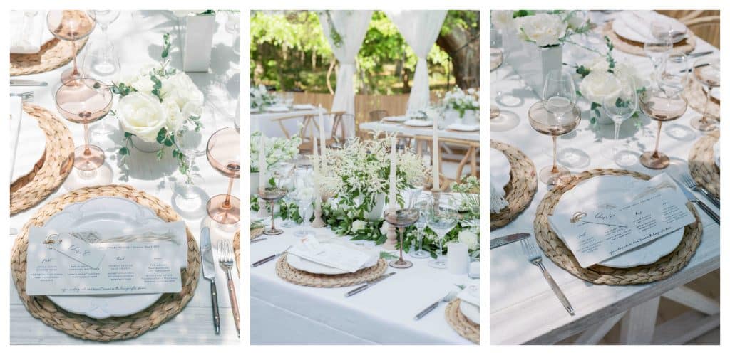
Sometimes, it makes the most sense to chose one or two “special” pieces that you want to work with. And, when paired with with more simple or basic pieces they pack a punch. Here, Estelle colored glass flutes and woven yarn pieces (for guests to keep) add unexpected touches to a neutral boho designed table.
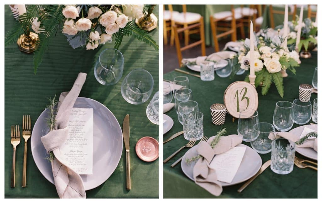
For this simple but chic table, green velvet linens set the stage. Then, a mix of metals and copper add design elements. Copper coasters are place card. And, a new “twist” on the napkins, we add a sprig of fresh green rosemary.
