Photo by Liz Banfield
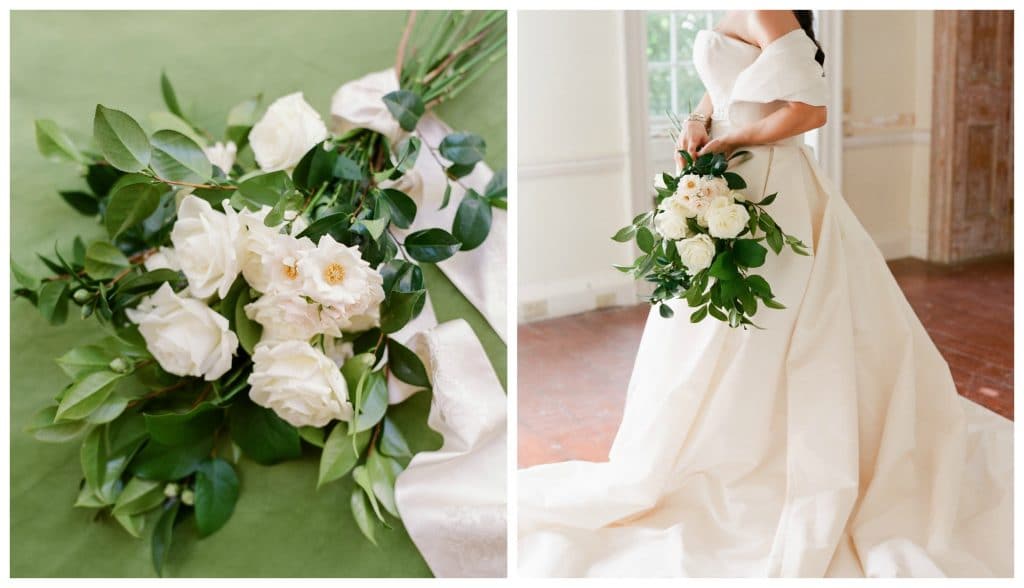
Designing flowers for our fall weddings means incorporating different color palettes, and using different materials. Above, traditional airy whites and creams find contrast in seasonal greenery. Greenery being a loose term in that it doesn’t all have to be green, rusty foliage offers a delicate balance.
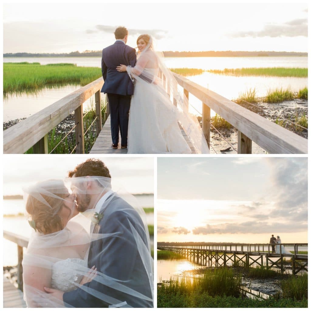
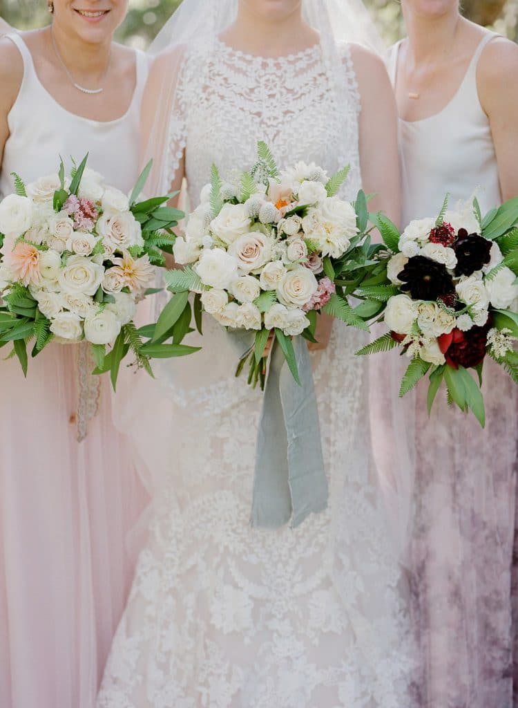 photo by Corbin Gurkin
I like being able to get creative and come up with something a little unexpected, which for us lately means softer colors or bringing in a metallic like rose gold or copper. For the Maid of honor in this wedding, darker blooms in the same family as the pastels were added for an ombre feel but as a special nod.
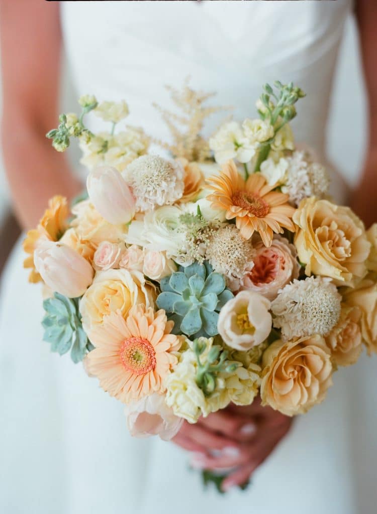
Photo by Liz Banfield
Without seeing the same old idea of it, this bouquet really says “harvest” to me. I love the blush and beige tones and the mix of different blooms. The succulent addition is a great and fun alternative for greenery.
Photos by Corbin Gurkin
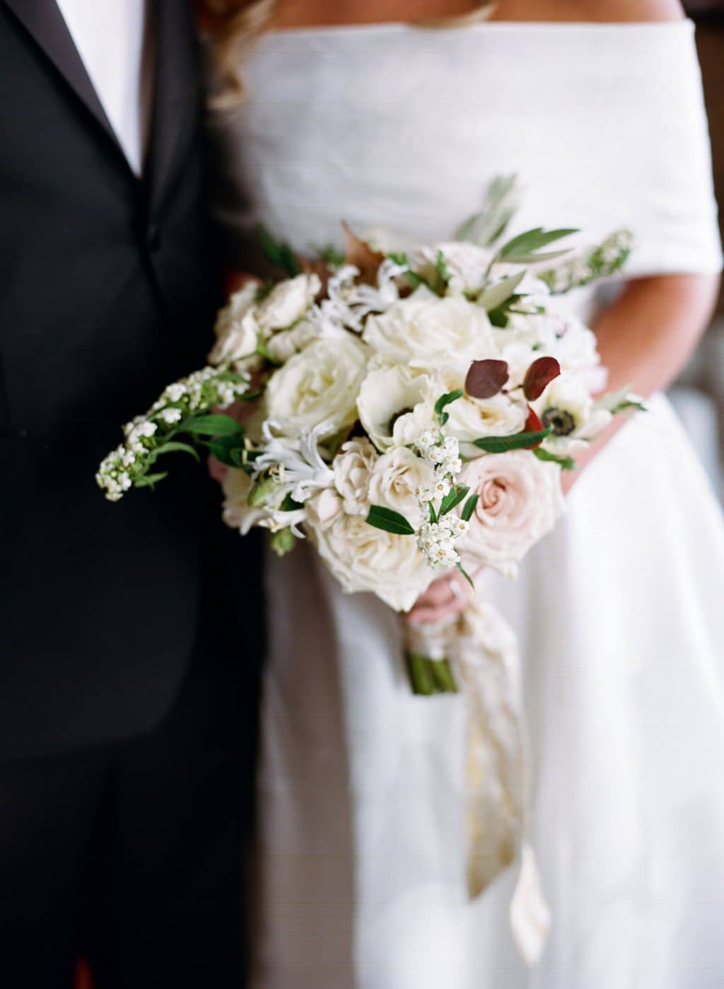
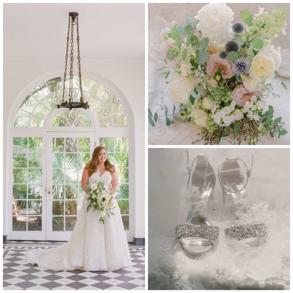
For this grand fall fete, a bouquet to match the grandness of the bridal gown was in order. There was a lot of “old world” feel to this wedding, so I thought a formal but very simple long stemmed bouquet could carry it’s weight with the dress. Long stemmed roses, and natural greenery with a few berries speckled in tied off with vintage silk ribbon.. if it’s possible for these two words to go together I think it’s full of an airy heaviness indicative of fall in Charleston.
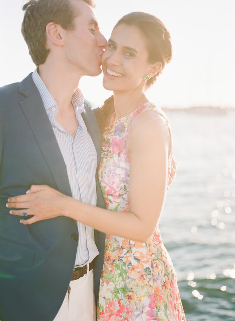
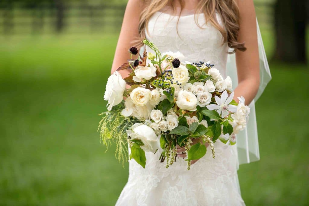 photo by Melanie Mauer
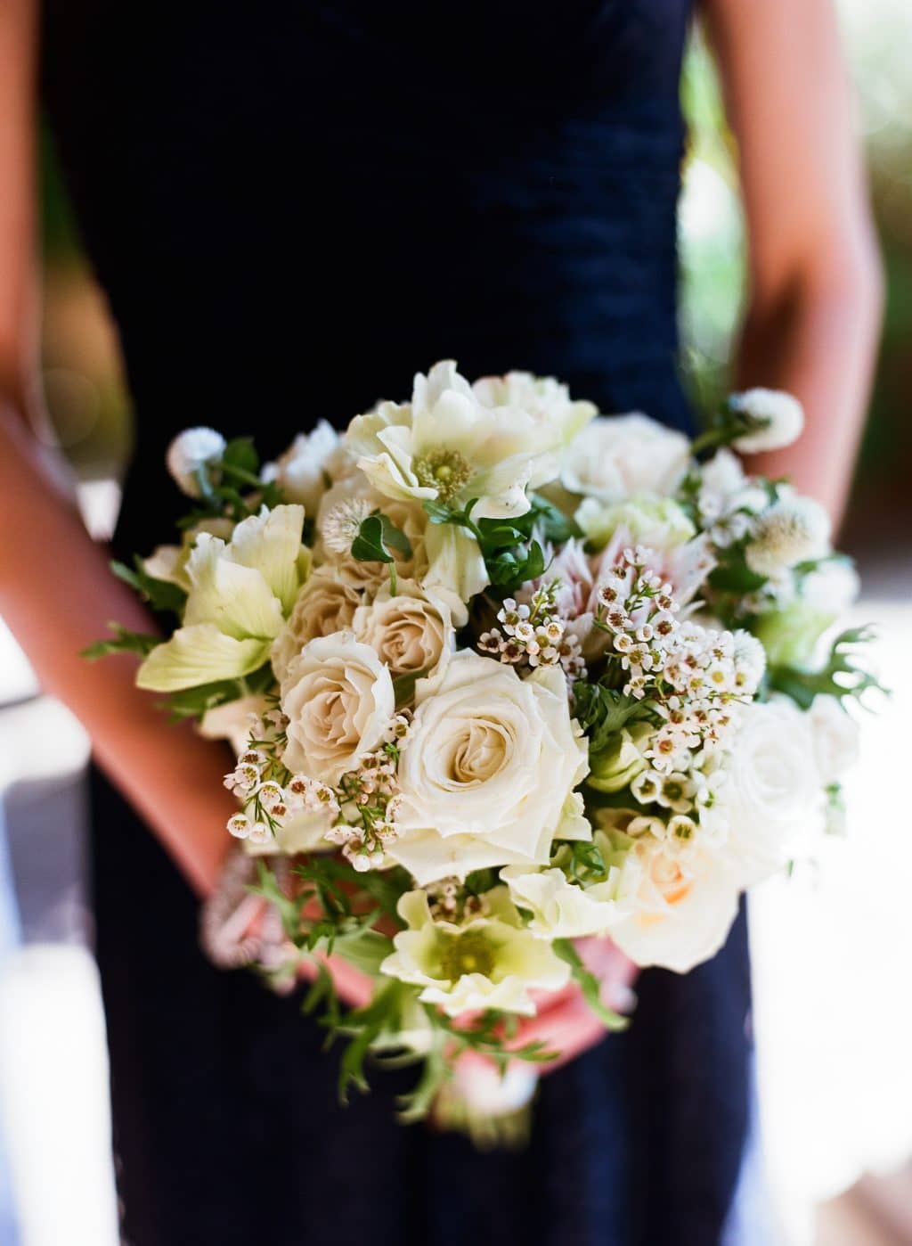
Photo by Liz Banfield
For both of these bouquets, textured looks was the dominate design element. Our bride’s bouquet add berries on the vine, wild clematis, and drapey greens gave a gathered from the garden look. The bridesmaids worn black gowns, so the shades of creams and beiges really popped. Flowers only available in this season like Anenomes and craspedia balls bring in a different look.
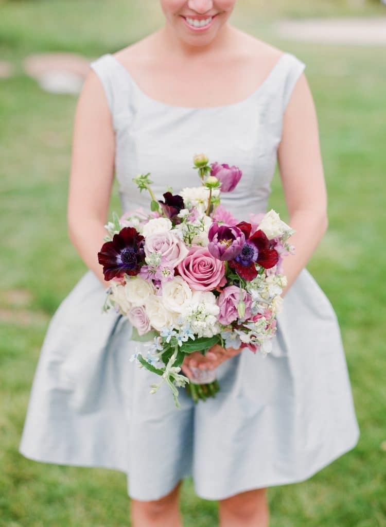 Photo by Corbin Gurkin
Deep wines and burgundies mixed with purple or pinks is one of my favorite color palettes… and I love the just gathered wild flower look that many people associate more with spring, but just as spectacular in fall.
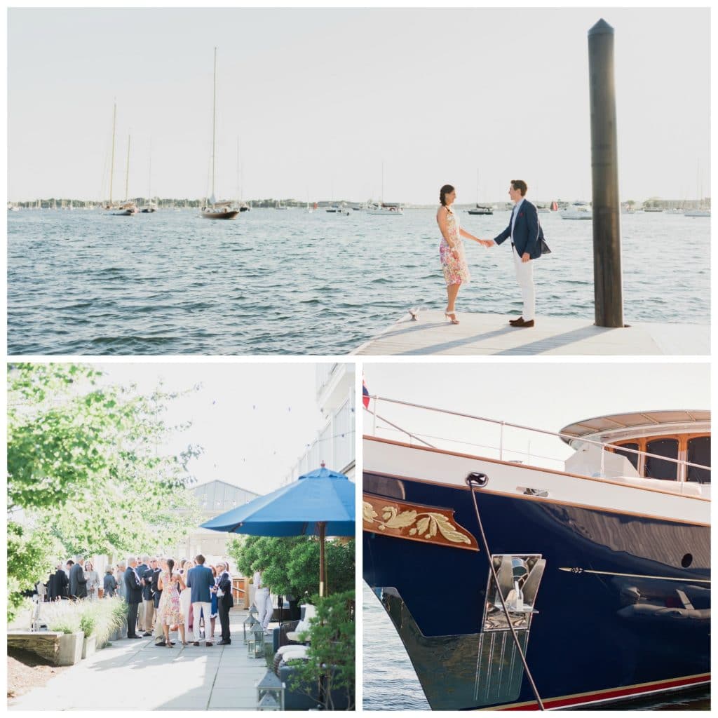
 Photo by
 A delicate pale palette can still work in Fall, dahlias and anemones are blooms true to the season, and adding in a hint of golden tones warms the collection.
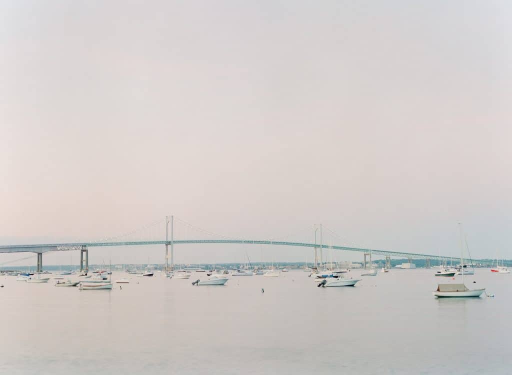
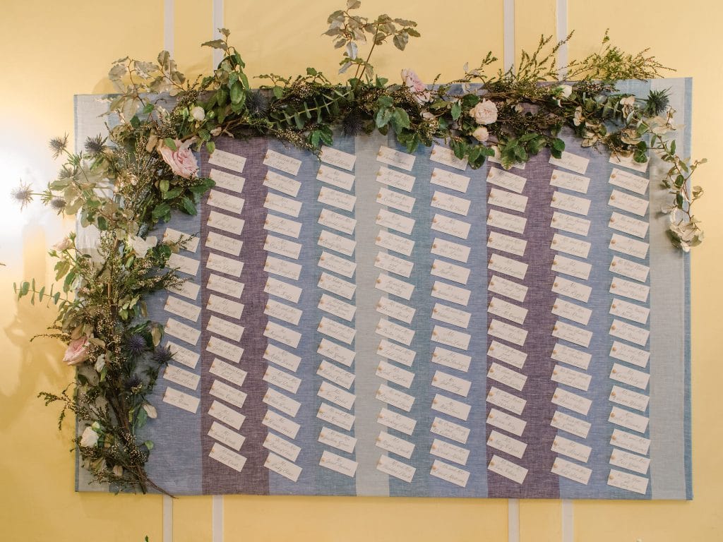
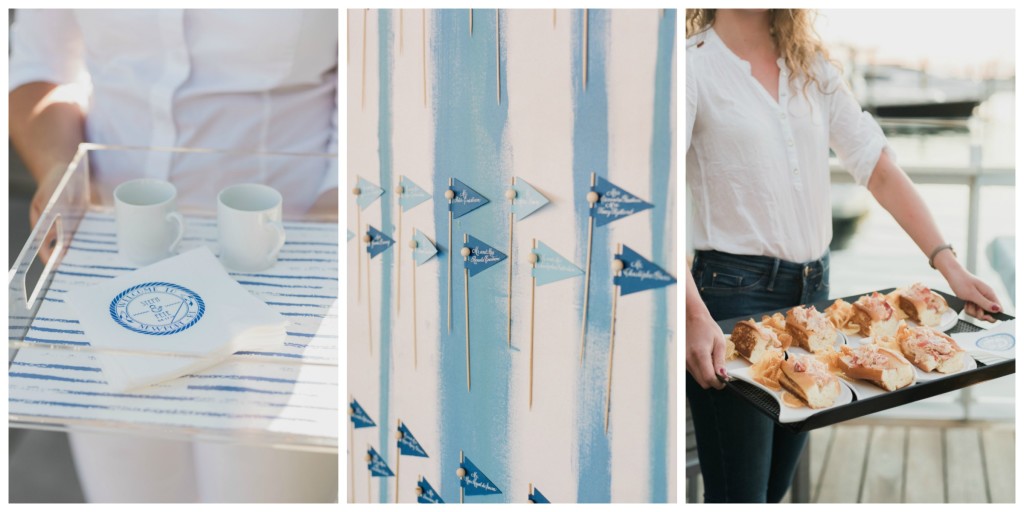 Guests enjoyed popular favorites like New England Clam Chowder and mini lobster rolls. Keeping in line with the sea colored palette, escort cards were nautical inspired flags displayed on a watercolored board.
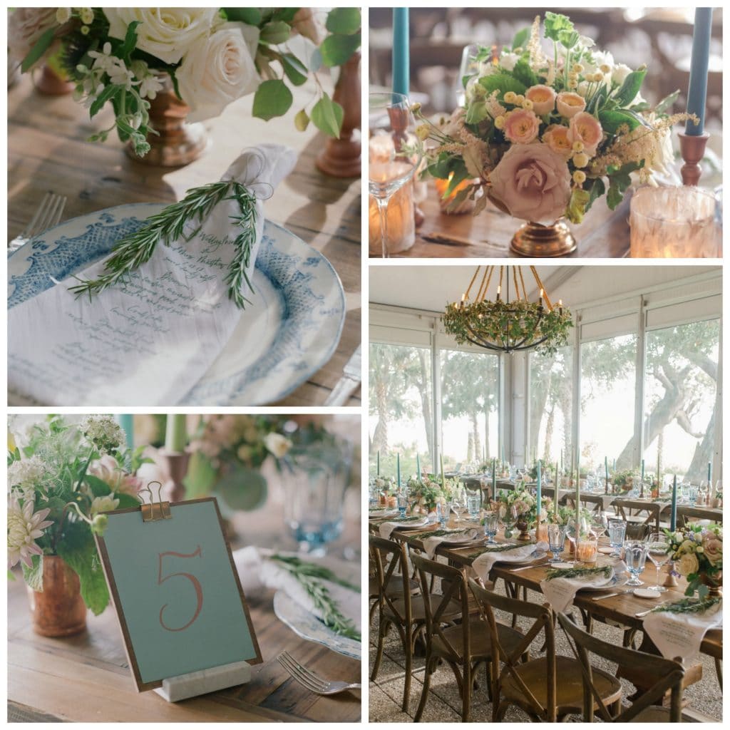
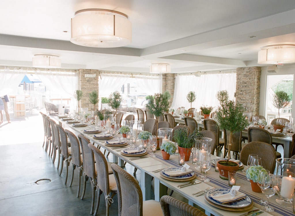 Keeping the decor natural and simple made the most sense for a nautical inspired feel. Table runners were of a french linen flour sack feel. Potted rosemary topiaries and simple hydrangea blooms dotted the length of the tables.
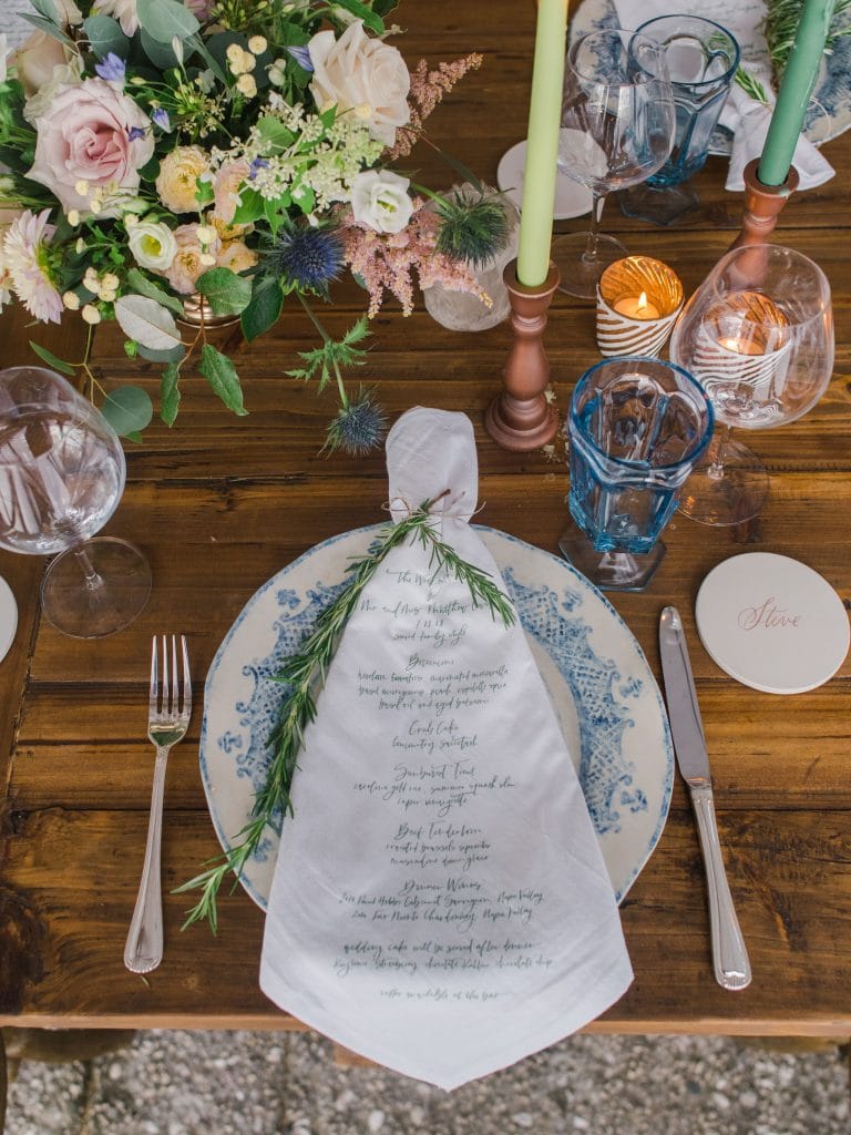
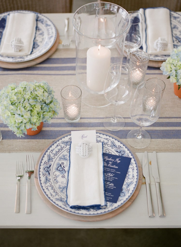 One of my new favorite design elements are colored border linen dinner napkins. So simple but they lend such an elegant touch. And, how cute were these white nautical rope balls which we used to “anchor” the place cards. White ink on navy paper is an unexpected but pretty way to present the dinner menus.
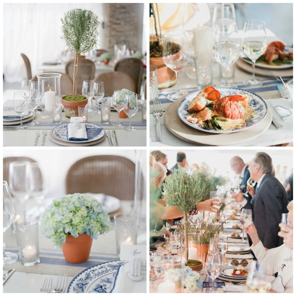 No seaside rehearsal dinner in New England would be complete without a lobster course.
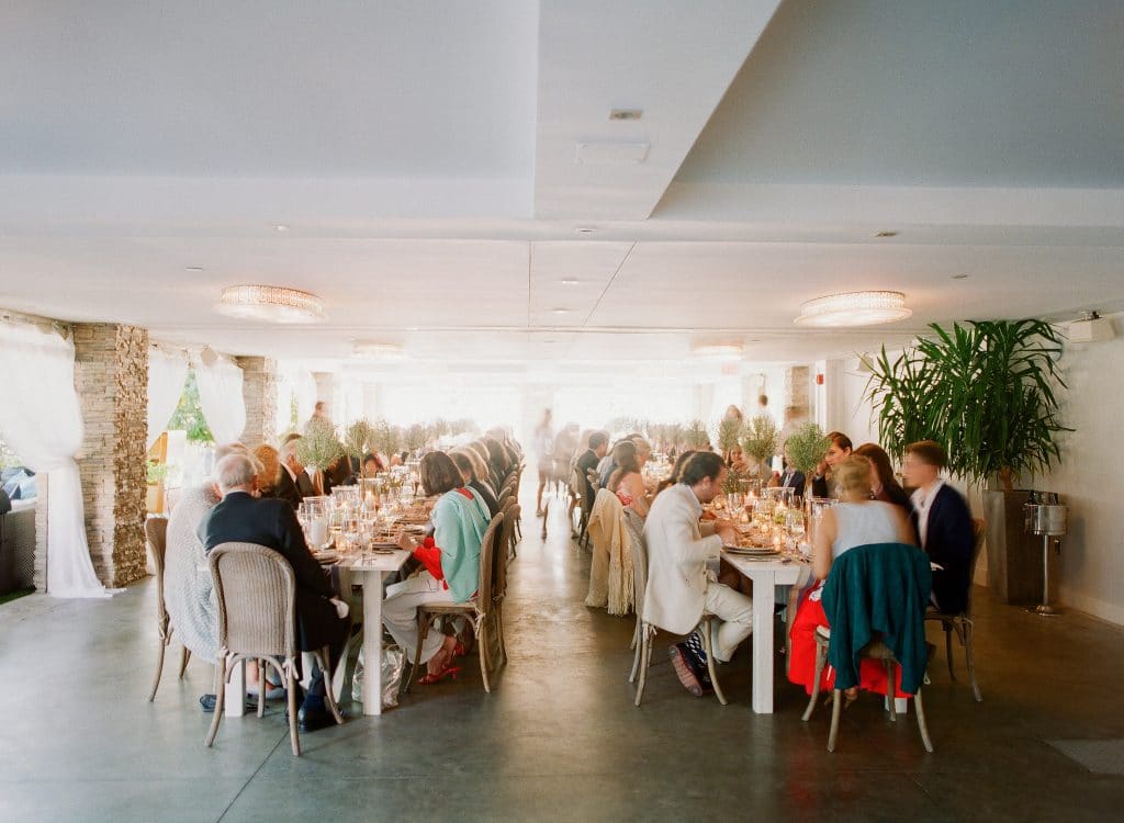
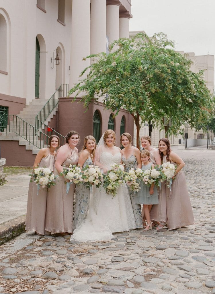
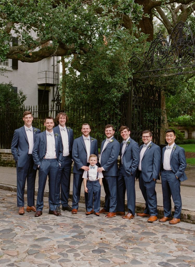 The men went with a modern take on the traditional suit opting for bowties instead of the long ties typically worn with suits (from Joseph A Banks).
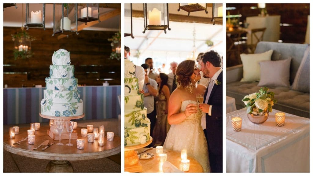 One of the biggest parts of my job when designing a wedding environment is thinking about the areas not to see in addition to creating what you do see. We wanted to hide an unsightly area on the side of the tent, and since we weren’t using any fabric draping our fabric walls would have looked out of place. So along with Snyder (our rental company) we built a wooden barn style wall.
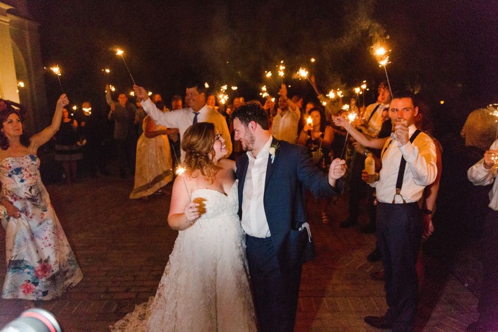
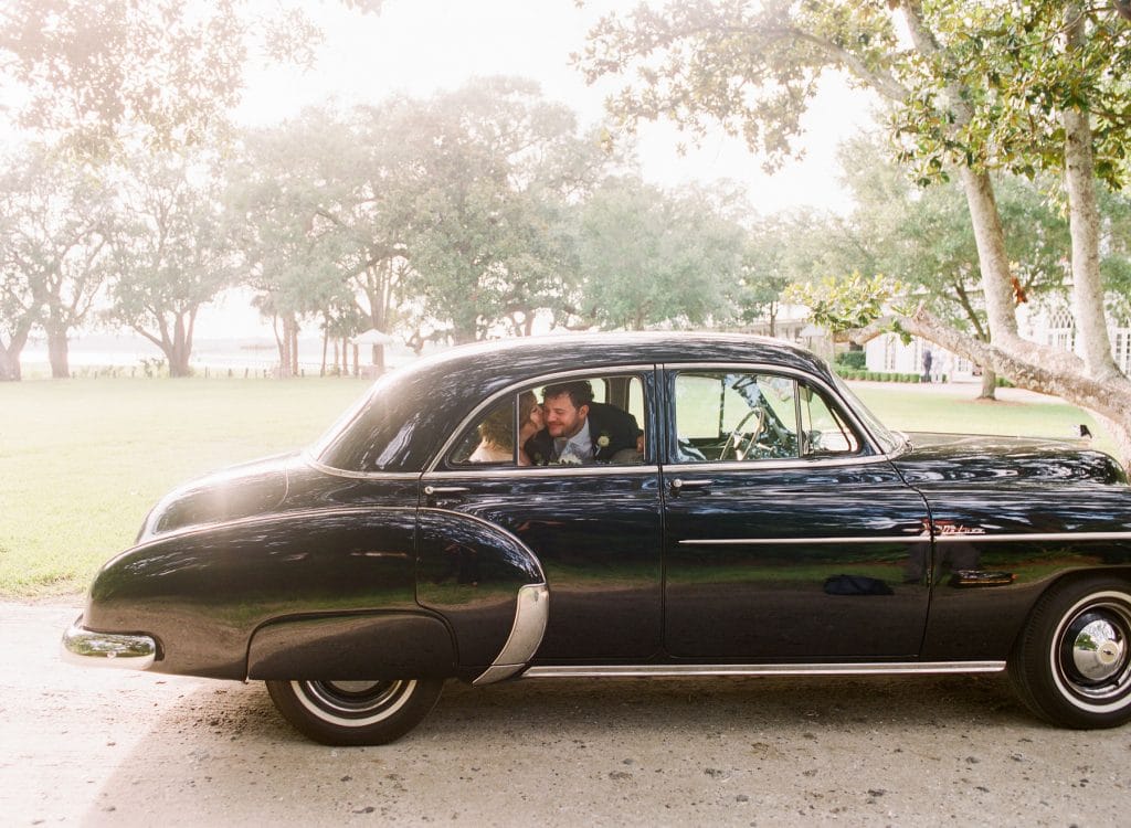
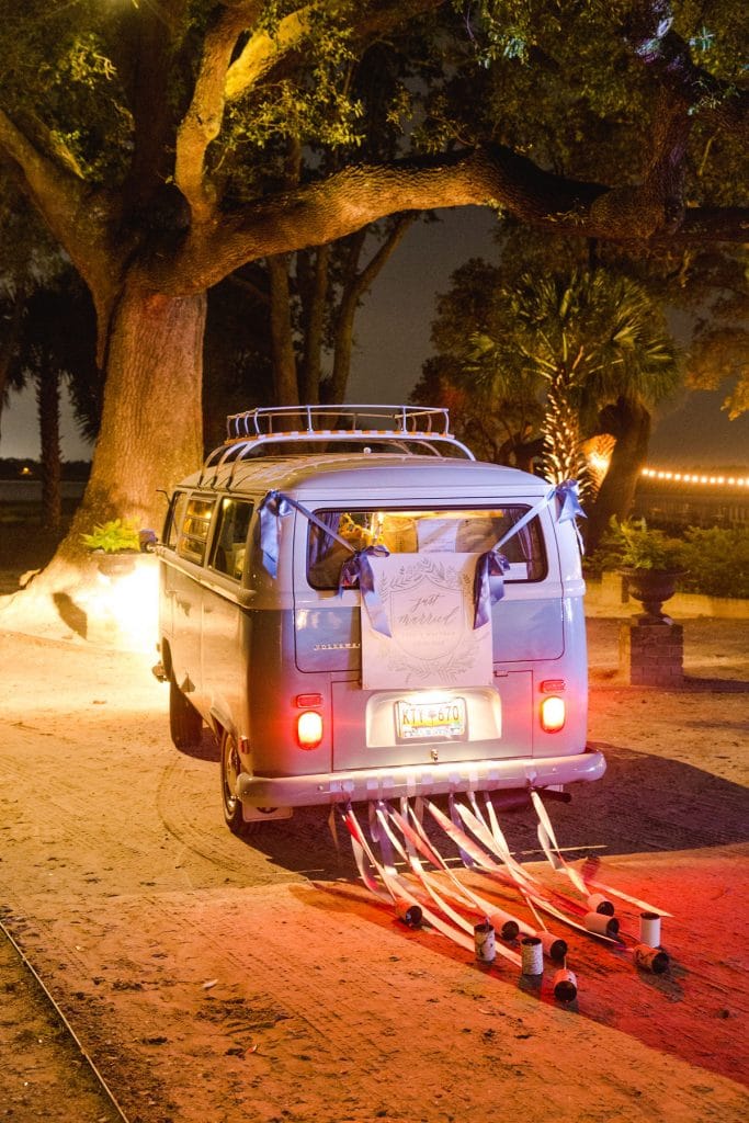 After a lovely sparkler send off, the couple departed in a nostalgic VW Beetle van for a perfect finishing touch! Thank you again to Charleston Weddings Mag for the constant support.