photo by Corbin Gurkin
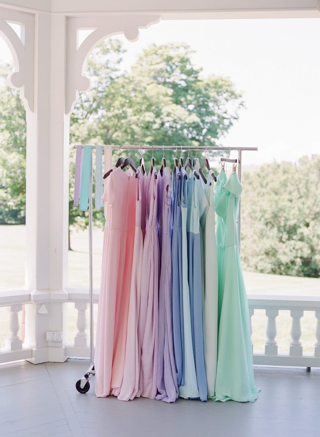
Last week we talked about some of the bigger trends we are seeing for weddings in 2017, and one is color! I think this is one thing that some brides struggle with and we always have fun putting together combinations, so today we are sharing some tips on choosing the right color palette for your wedding day.
photos by Corbin Gurkin
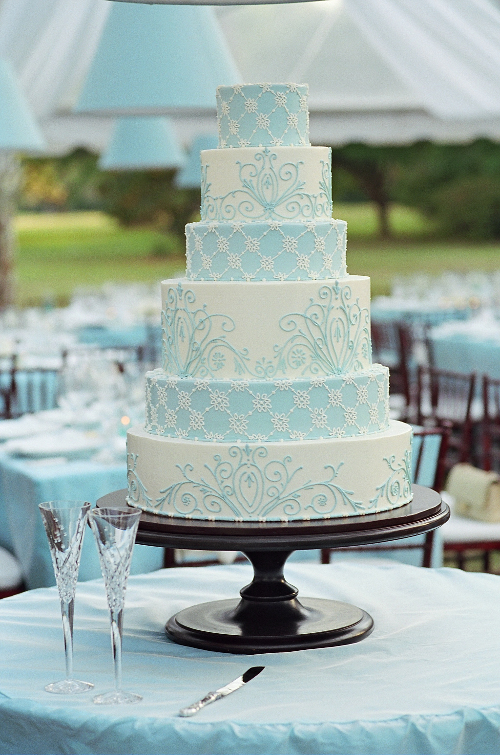
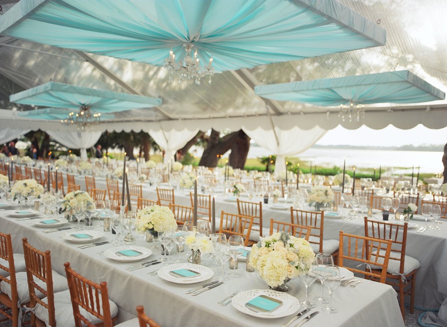
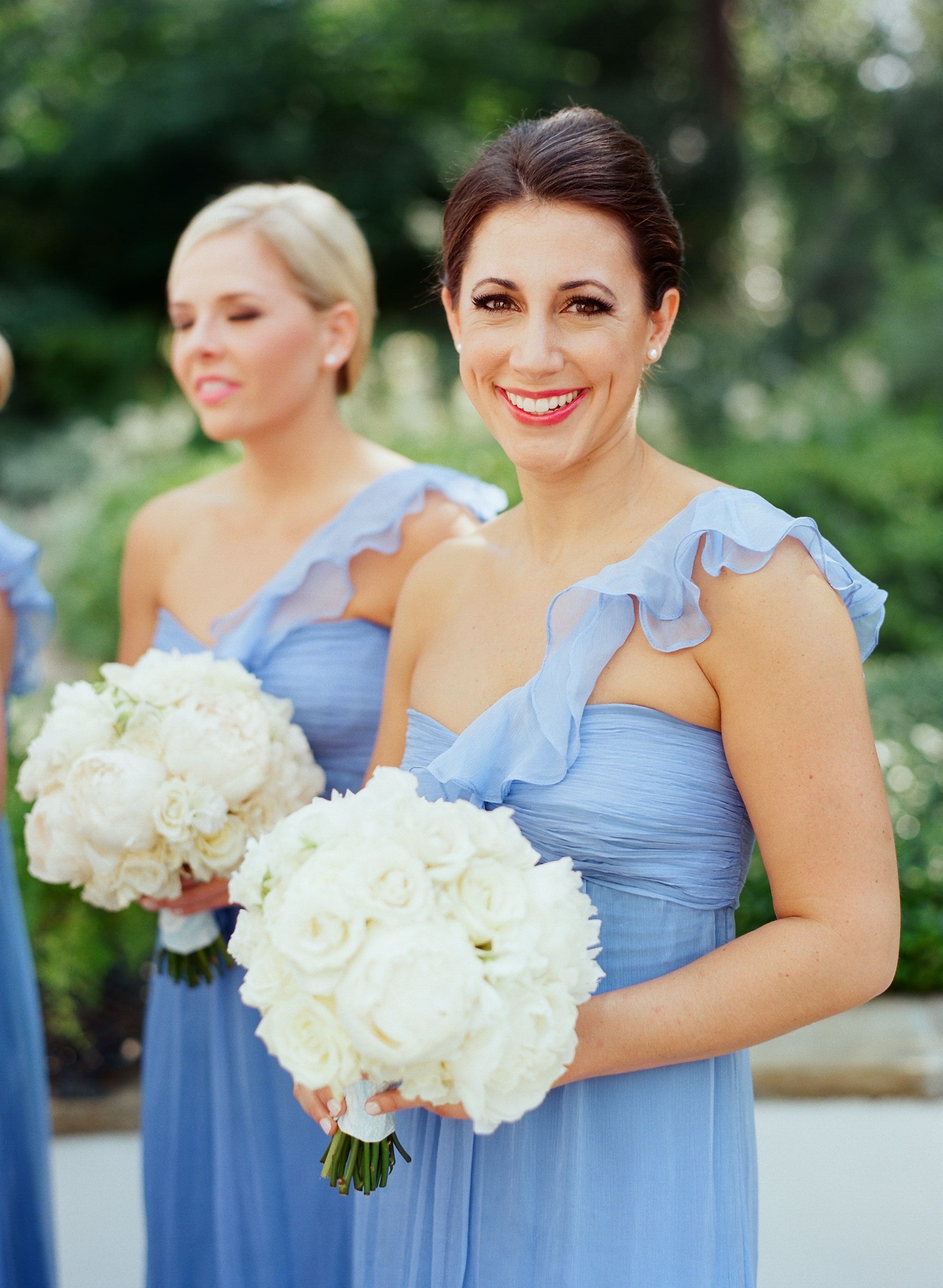
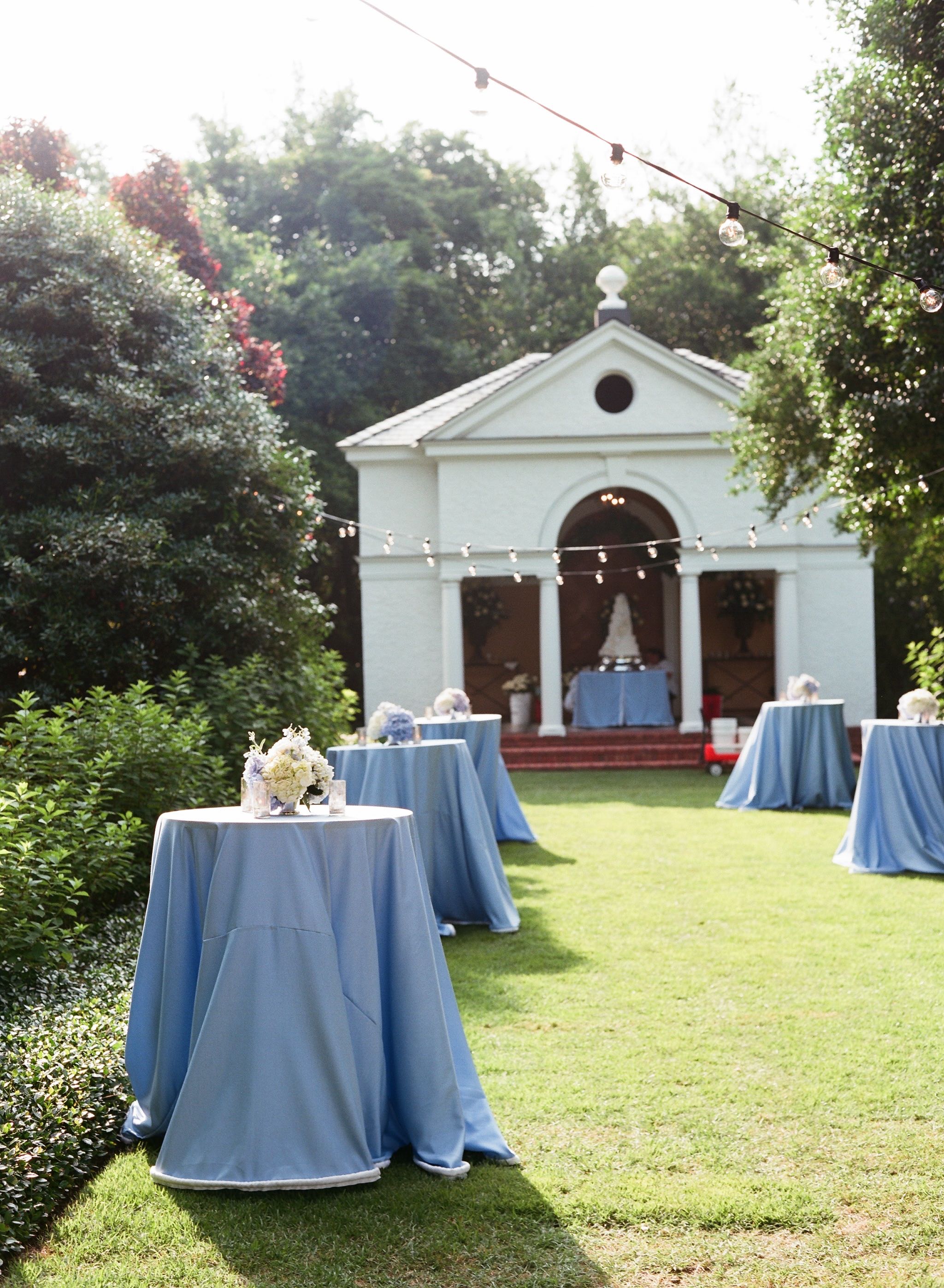
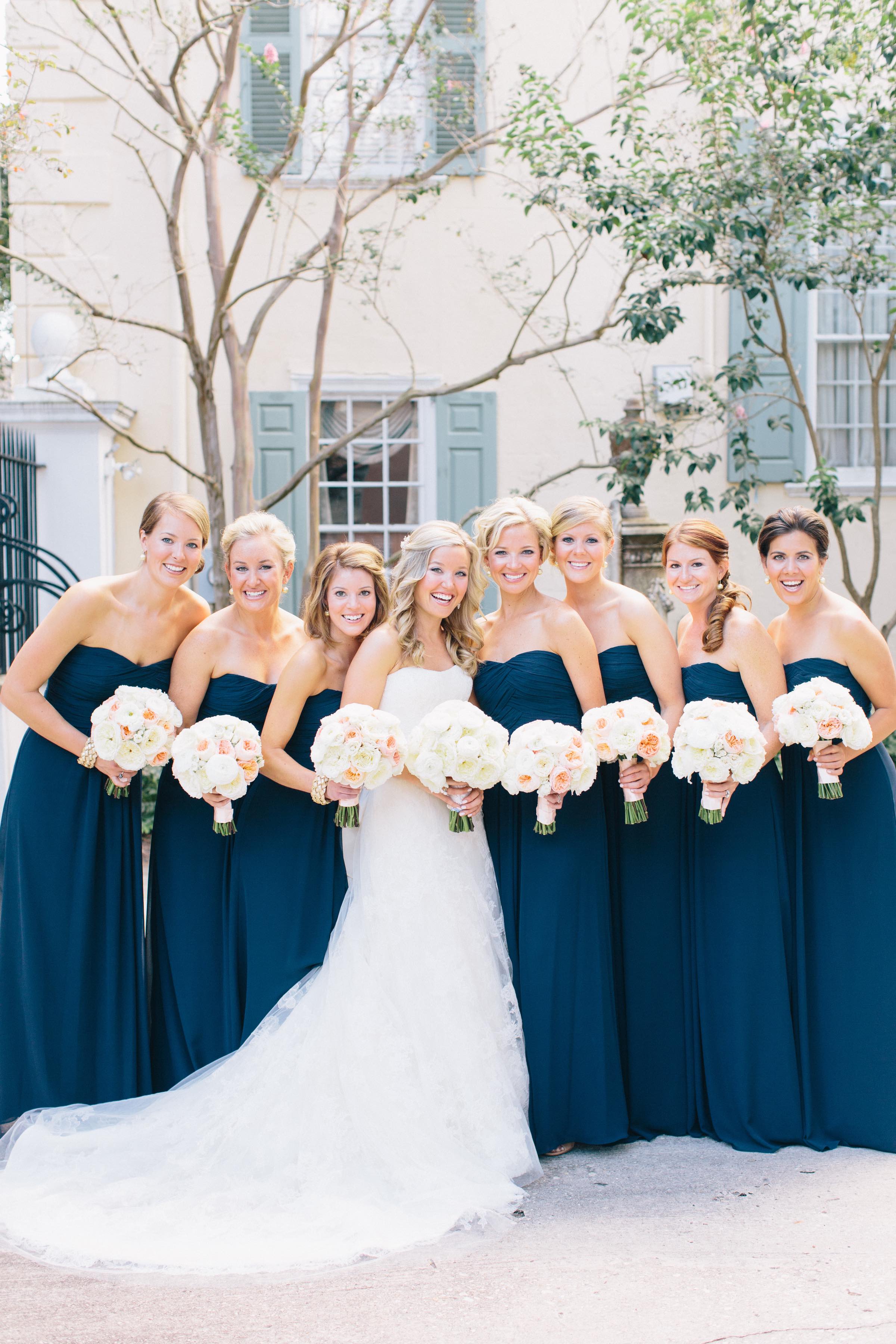
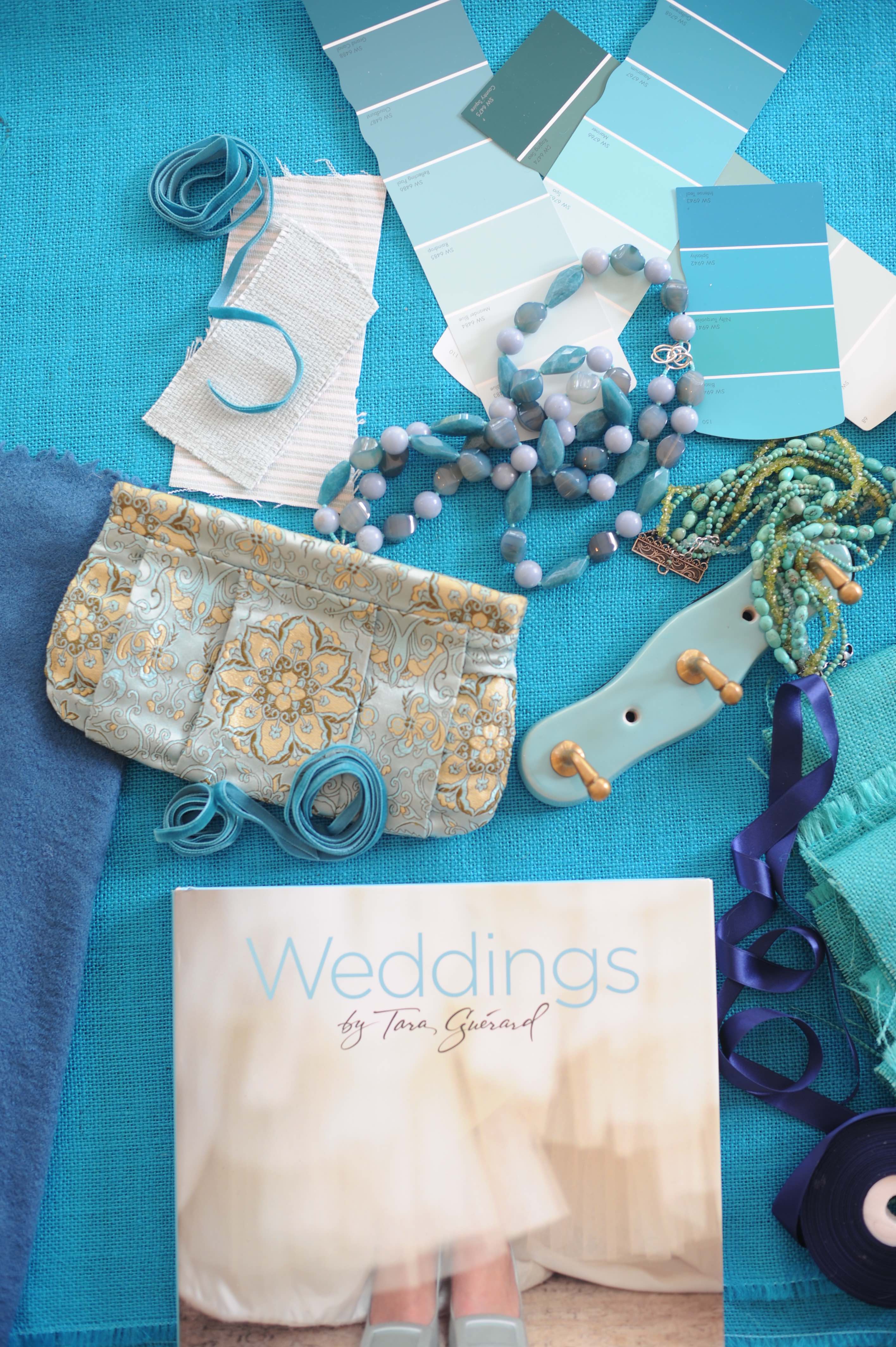
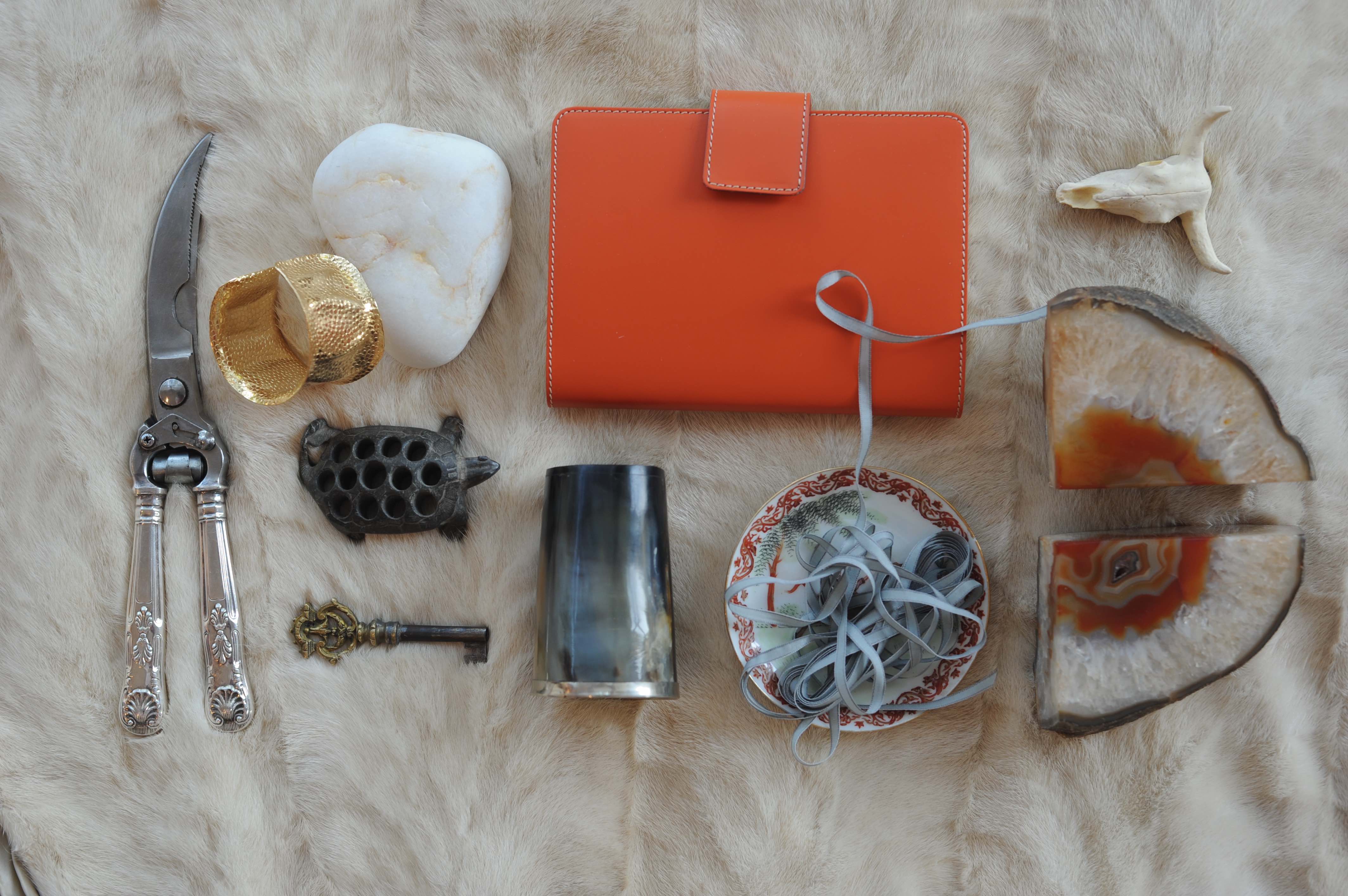
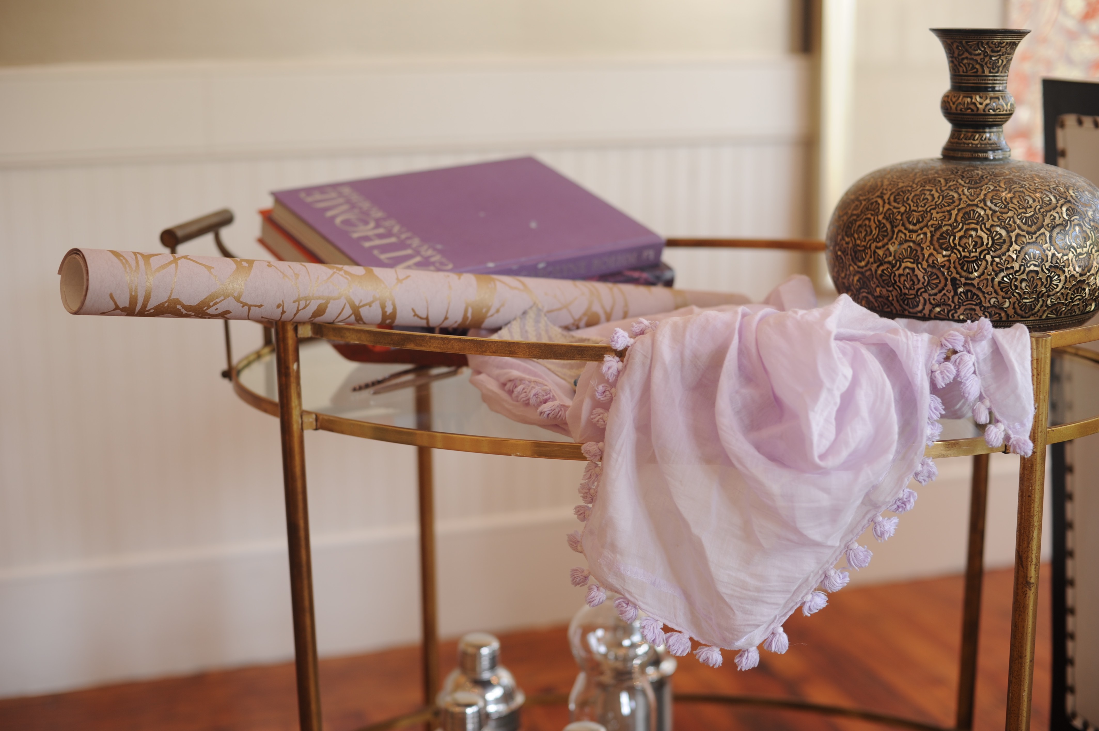
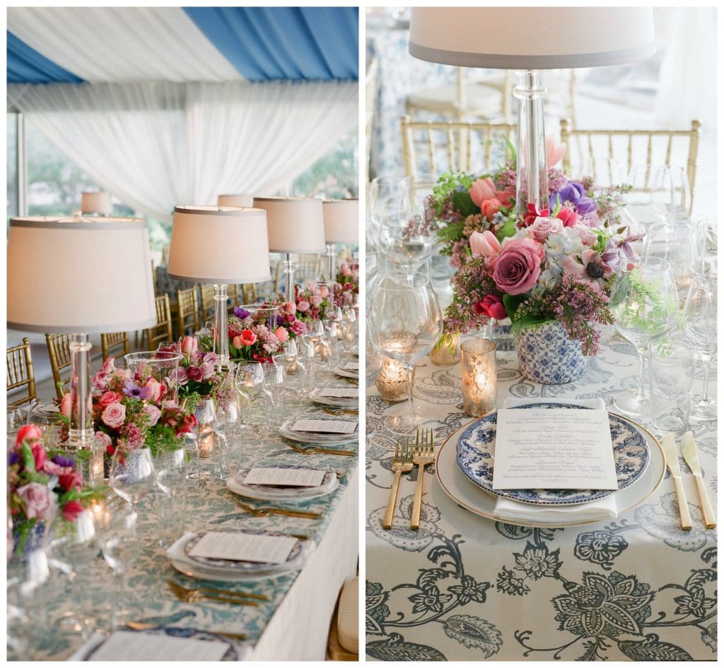
One of the most tried and true color combinations we’ve been working with for years is blue and white. However, we think it’s a mistake thinking that you have to stick to two dominant colors when designing. Using classic color combinations is a great anchor, but punching it up with variations of color in flowers, or in compliments here and there is a great way to brighten it up without going all out rainbow.
photos by Corbin Gurkin
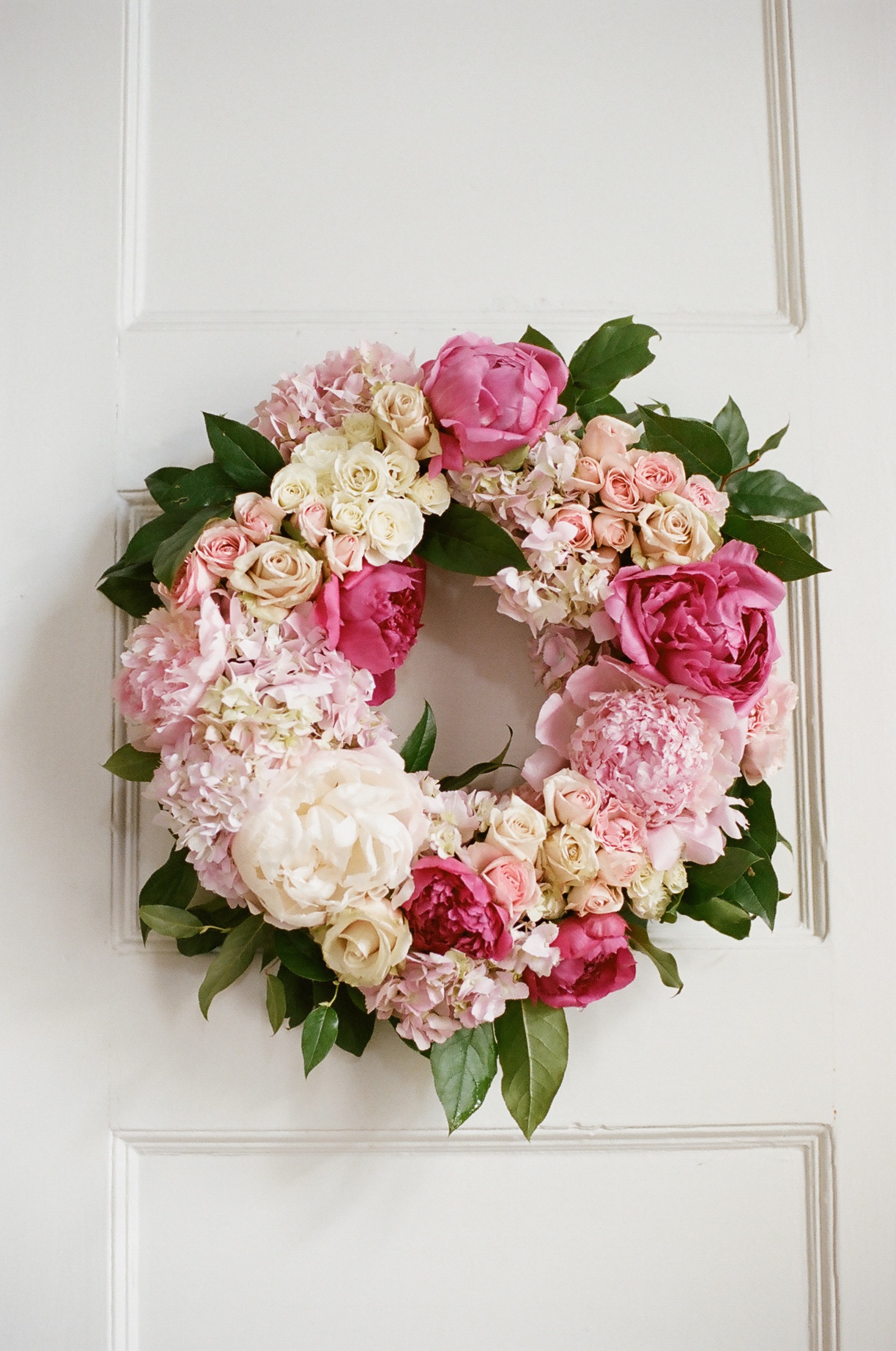
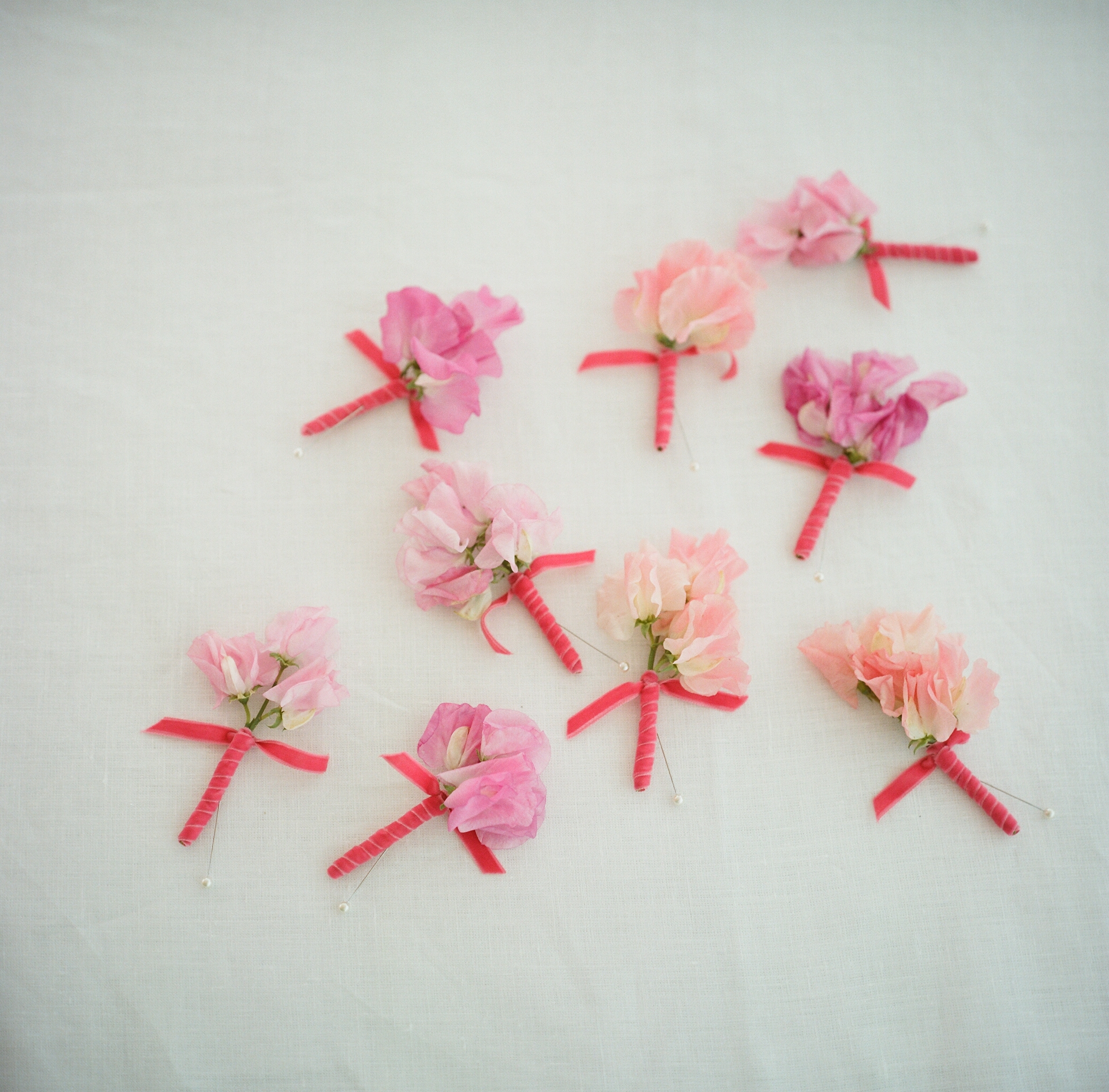
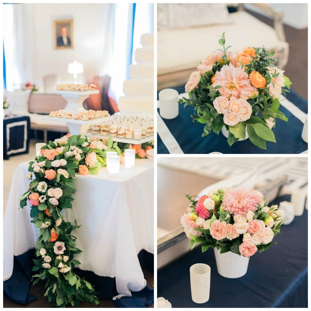
If you are drawn to bright colors, think about the overall ratio in using them. Softer versions of bright colors like pinks, oranges, and corals still make a big pop against something like a navy blue but might start to look like a birthday party if put with another shade of pink or bright aqua. When using brighter hues, I’ve been a big fan of how mixing shades of them together has turned out, and adding in some greenery can help the blending.
photos by Corbin Gurkin
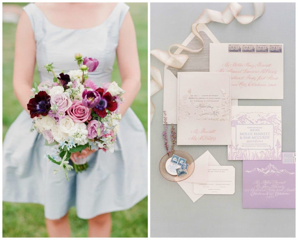
Don’t forget to introduce your color palette early on- think save the dates or invitations. The paper elements set guests expectations early on, so why not introduce your palette from the beginning and set the stage.
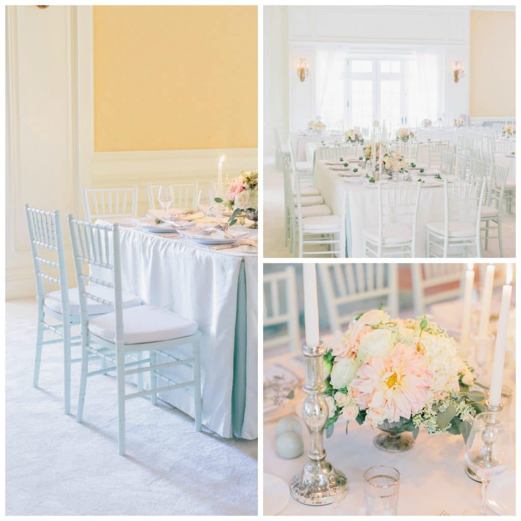
photo by Corbin Gurkin
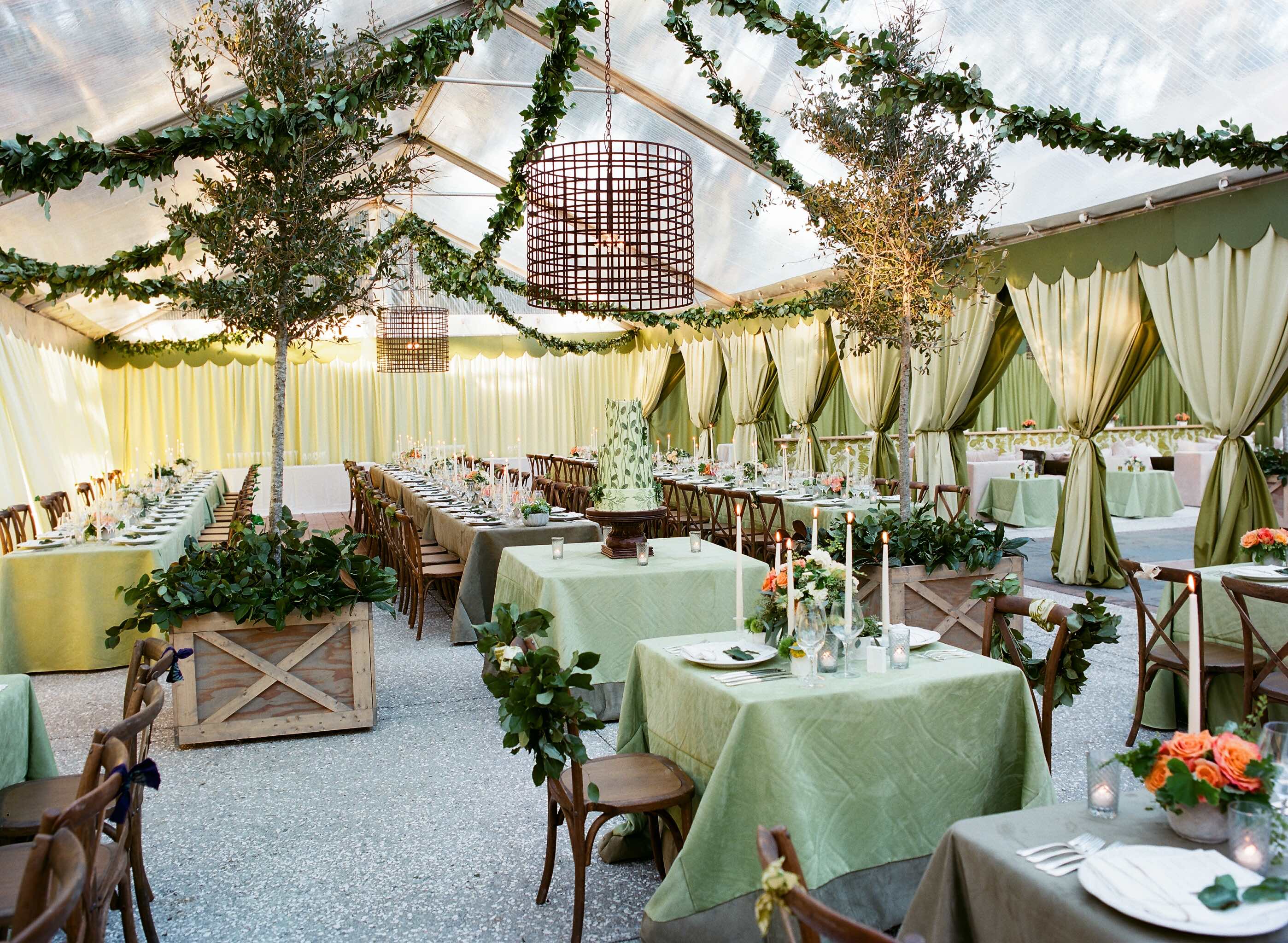
Think about your venue and it’s decor. For this bride who wanted a muted fall palette the heavy emerald green and mustard yellow carpet would absolutely hinder her look, so we carpeted over it with a neutral tone. This can be an unexpected addition to the budget.
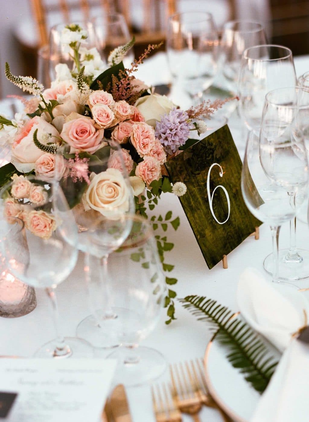
photo by Liz Banfield
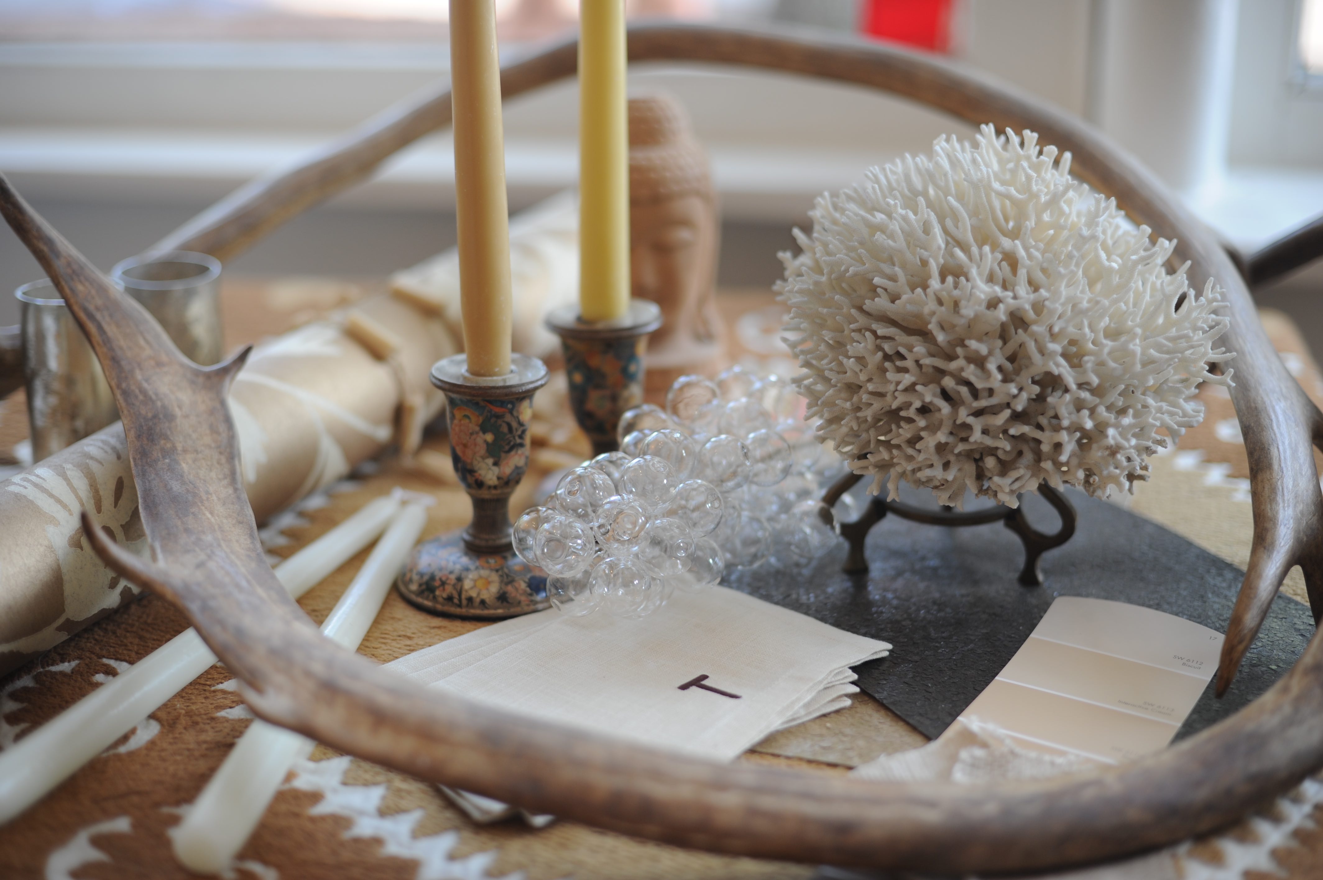
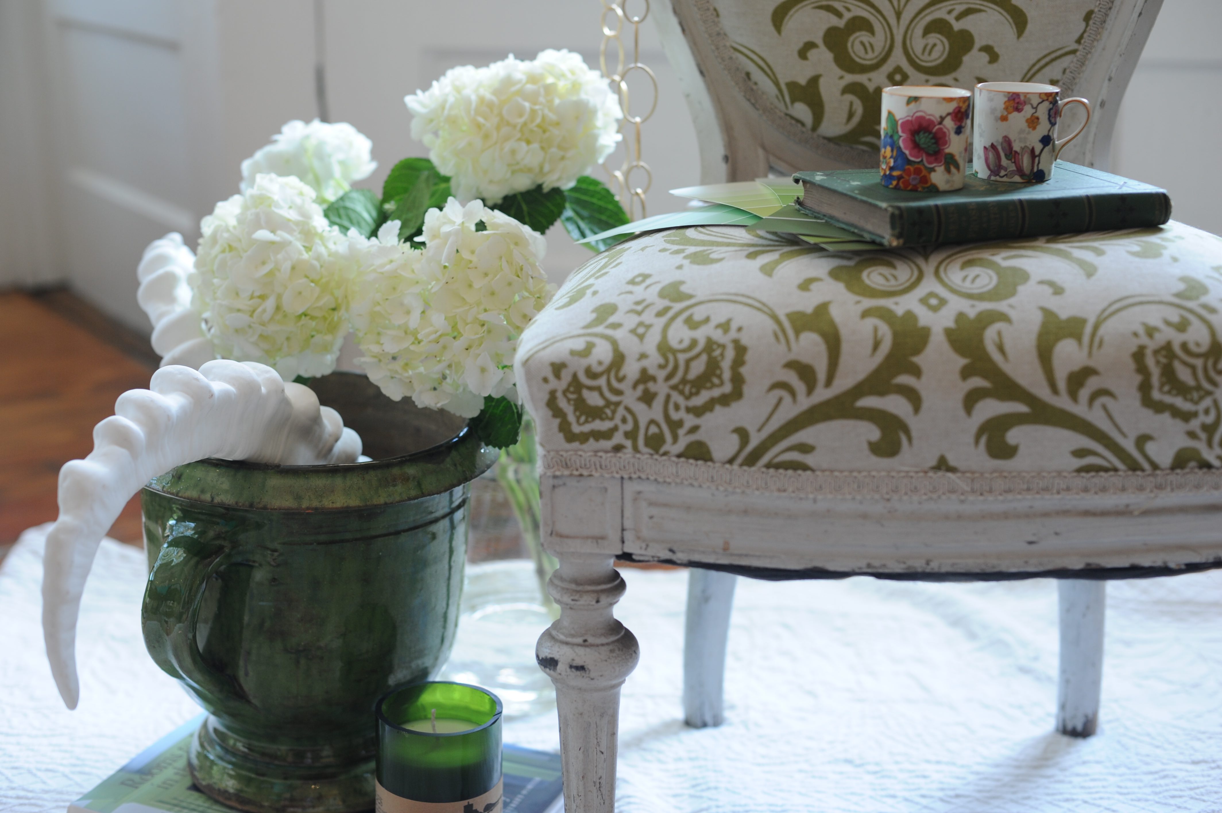
Think of seasonal cross overs. A pretty pink or purple flower combination is typically thought of for spring or summer. But, here used with green velvet, deeper green ferns, and heavier brass flatware, it becomes perfect for a fall wedding.
Happy Planning!